What Is a UX Audit? What It Covers & How It Works
What a UX audit covers, what affects cost, how available evidence informs findings, and how to turn prioritised recommendations into decisions.
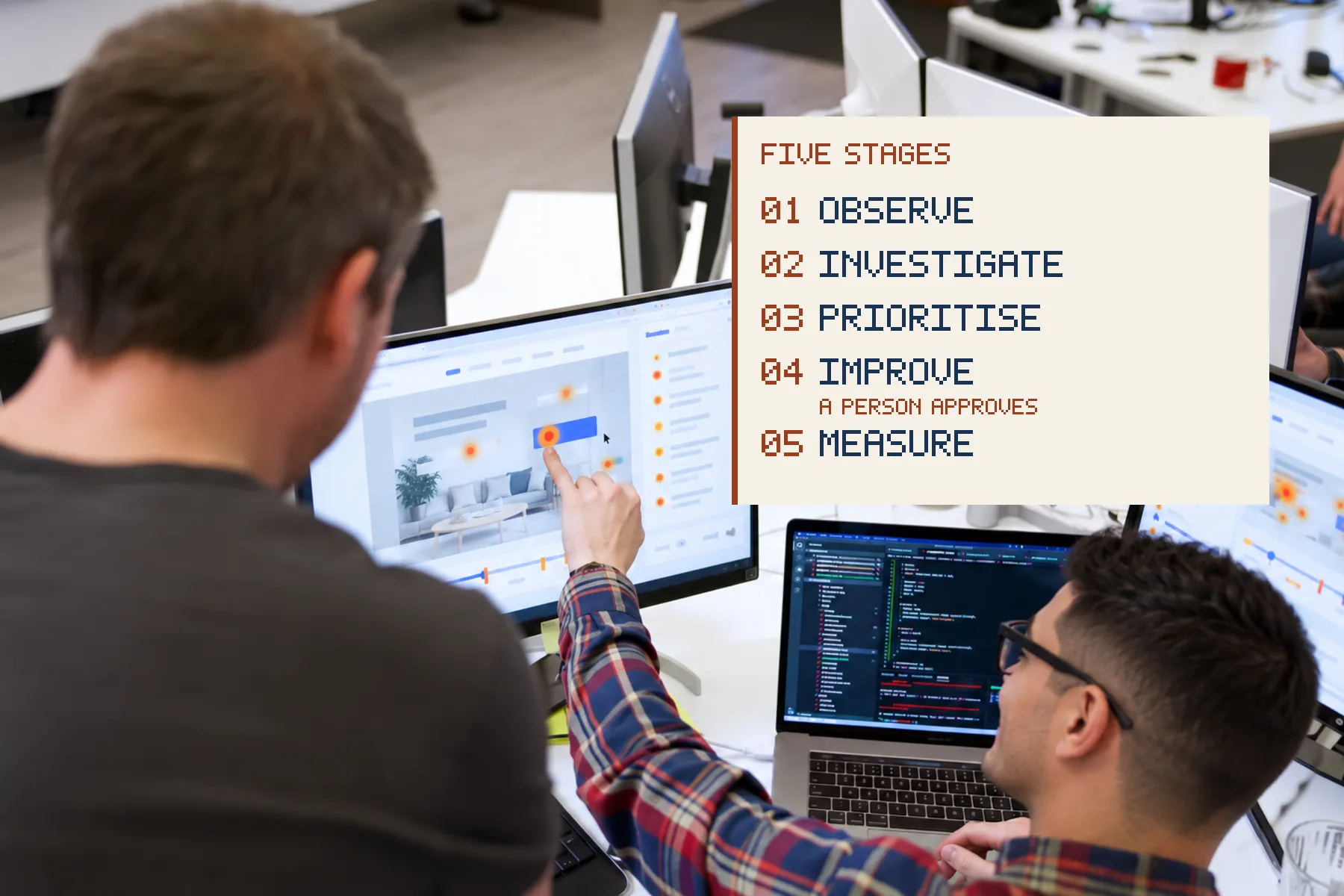
What is a UX audit? It is a structured review of likely usability and conversion friction, using the evidence available for the journeys in scope, and what to fix first. At Code23 we run them against real journeys, analytics and session recordings rather than taste, then hand you a fix list ranked by impact and effort, not a moodboard. We scope a fixed fee against the pages and journeys in scope, price any changes before we make them, and pair human judgement with agent-assisted crawls, so coverage runs wider than a single afternoon of clicking.
What a UX audit is and what it covers
What is a UX audit?
A UX audit is an expert evaluation of usability and conversion friction on a live site or product, using heuristics, journey walkthroughs and available quantitative or qualitative evidence to produce ranked recommendations you can ship.
How much does a UX audit cost?
UX-audit pricing depends on the pages, journeys, user roles, research, access and evidence required. Code23 scopes a fixed fee once those are known, and prices any changes before we make them.
How long does a UX audit take?
Timing depends on the same variables as cost: scope, access and how much evidence needs gathering. We agree a delivery window once we’ve scoped the work, rather than quoting a fixed number of weeks upfront.
What is included in a UX audit?
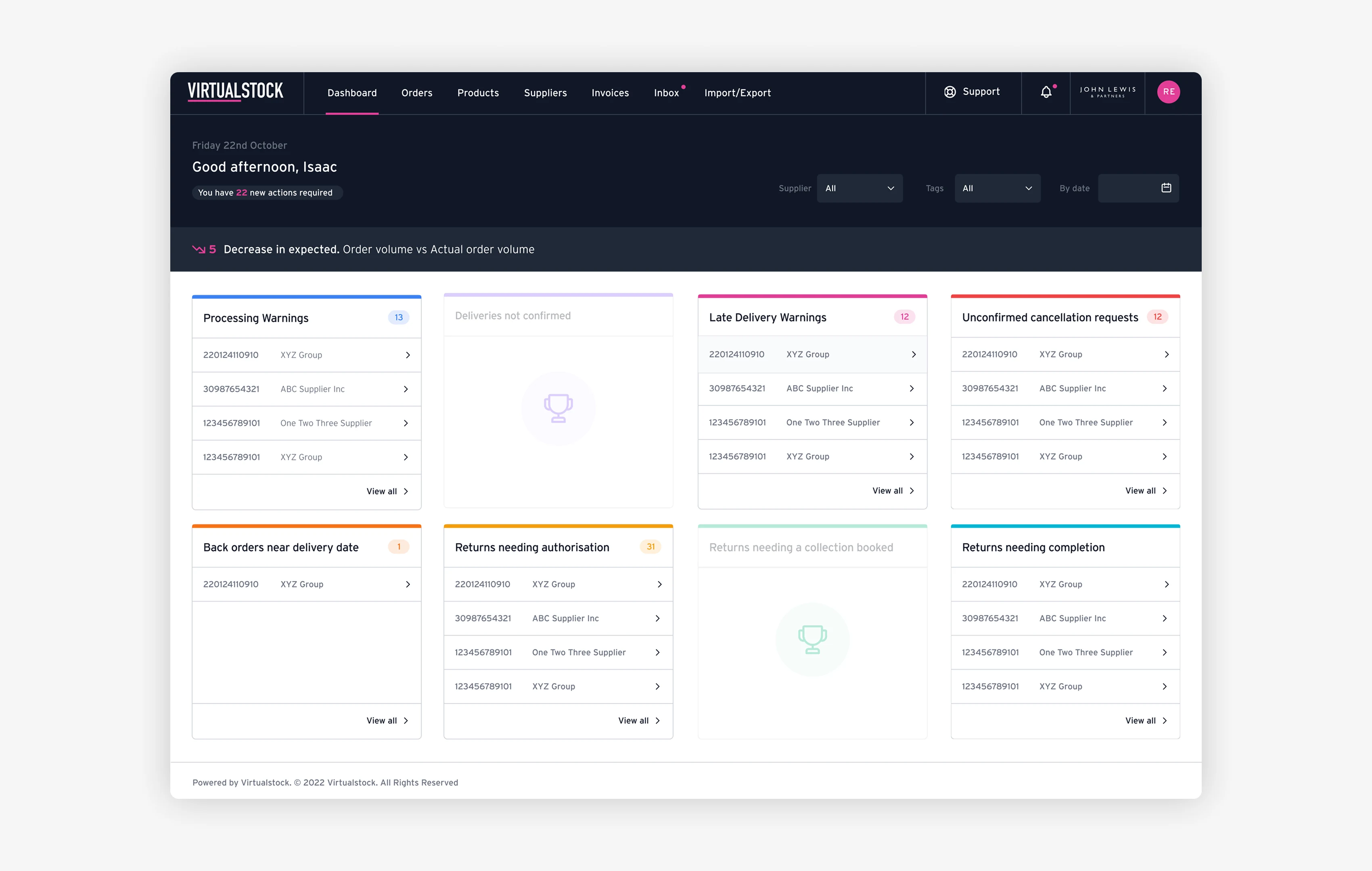
Expect journey maps of the money paths, heuristic and accessibility notes, analytics or session evidence where available, severity-rated findings, and a fix list ordered by impact versus effort - screenshots and short clips beat vague adjectives.
Price and book the entry offer through product design. Related money context when the audit says rebuild: website redesign cost.
Our method: heuristics, analytics, session evidence, agent-assisted crawls
We do not audit from taste alone. The stack:
- Heuristics. Clarity, consistency, error prevention, mobile affordances - classic usability lenses applied to your flows, not a generic template checklist pasted onto every client.
- Analytics. Where traffic enters, where it dies, device split, form starts vs completions. Analytics can show where measured drop-off occurs; heuristic findings should be labelled as expert assessment rather than measured cause.
- Session evidence. Watch real attempts when privacy allows. Rage clicks and looped form fields show up faster on video than in a slide.
- Agent-assisted crawls. Overnight agents walk charters across templates, broken states and accessibility smells - the pipeline behind AI agent QA - then humans triage severity and taste.
- Human approval. Agents expand coverage; they do not own release priority or brand judgement. That split matches how we think about AI and design in will AI replace UX designers.
Mastery is knowing which finding is a ship-this-week patch and which is a redesign trigger. Coverage without triage is noise.
Common issues to inspect
Examples worth checking include:
- Primary CTA fights the chrome. Navigation, chat widgets and cookie banners compete with the primary conversion.
- Forms ask for biography. Optional fields marked required; mobile keyboards wrong for the data type; error messages that blame the user.
- Trust arrives too late. Proof, delivery expectations and pricing caveats sitting below the fold on mobile may sit too late to influence the decision.
- Template IA. Marketing sites that mirror the org chart instead of the buyer’s job; related: when CRO hits a ceiling, see improve conversion rate.
- Accessibility debt. Contrast failures, missing labels, keyboard traps. Accessibility defects vary widely in effort and can create legal, commercial and usability risk if ignored.
- Performance as UX. Slow LCP can prevent content appearing promptly on product templates, which can feel like confusing UX even when the design itself is fine.
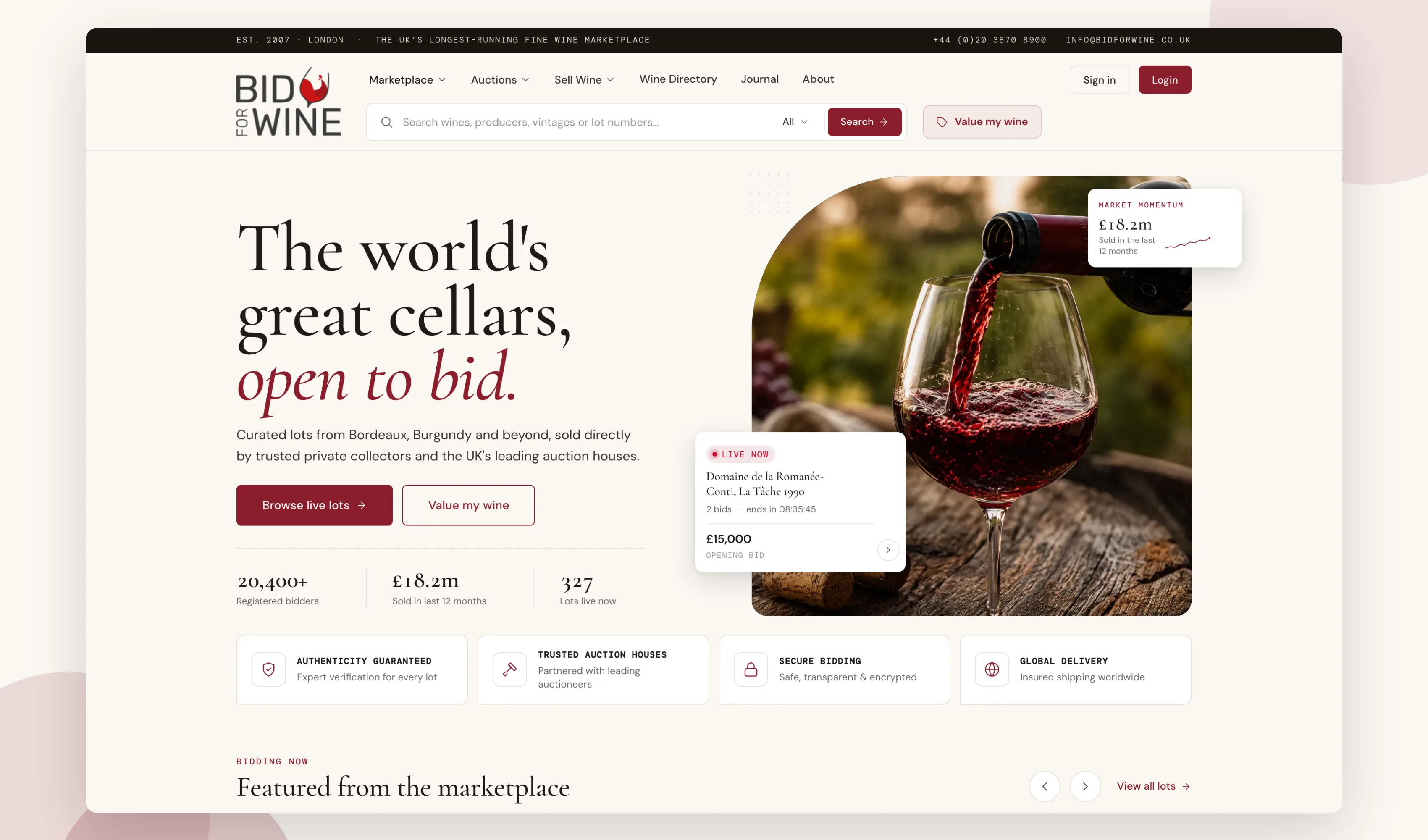
When clients approve public screenshots and metrics, we publish them. Until then, the method and the pattern list are the honest asset.
"Code23 have most definitely got the 'WOW' factor. Eye catching design, superb user experience and extremely well project managed end-to-end… I can't recommend enough."
Audit to action: how findings become a fix list with priorities
An audit that ends as a PDF graveyard has failed. We score each finding on:
- Impact on the primary journey (enquiry, purchase, booking, activation)
- Evidence strength (analytics + session vs heuristic-only)
- Effort (copy change, component fix, IA change, rebuild)
- Risk (legal, accessibility, revenue)
Then we bucket:
- Ship this sprint - copy, hierarchy, form fields, broken states
- Plan this quarter - template changes, navigation, proof blocks
- Strategic - redesign, replatform, or CRO programme
Owners matter. A fix without a person and a release window is decoration. After the audit, many teams either run fixes under a build band or continue under Support & Growth; others need the redesign conversation with eyes open on redesign cost.
When you need an audit vs a redesign vs CRO
Choose an audit when you suspect friction but cannot name it, before you spend on a full visual rebuild, or when stakeholders disagree about what is broken.
Choose CRO when the template is basically right and you need experiment discipline on specific leaks - conversion rate work.
Choose a redesign when IA, CMS limits or brand system are the constraint, not a single CTA colour. Audit first if the brief is still fuzzy.
Consider a heuristic or accessibility audit first when you have no analytics, no primary KPI and no owner, since a full evidence-based audit needs measurement in place. Fix measurement in parallel, then bring in traffic and journey data as it becomes available.
Frequently asked questions
Is a UX audit worth it if I don’t have much traffic yet?
Low traffic limits quantitative conclusions, but heuristic, accessibility and qualitative research can still provide useful evidence. Get analytics in place, then wait for enough representative sessions rather than a fixed number of weeks. Once you have that traffic and the primary conversion you care about, we’ll tell you what the evidence actually shows.
What’s the difference between a UX audit and user testing?
A UX audit combines expert review with heuristics, analytics and session evidence, where it exists. User testing observes real people attempting tasks on prototypes or live pages while we watch. We use both: an audit finds where the available evidence points to friction, then targeted testing checks a specific fix before it ships, rather than guessing twice.
Do I need analytics access before starting a UX audit?
Not essential, but it helps a lot. Analytics tells us where traffic enters and where it drops off, which sharpens where we spend audit time. If analytics is absent, agree whether instrumentation is part of the scope and avoid quantified conversion claims until enough representative data exists.
Can a UX audit increase enquiries without a full redesign?
Some of what our audits surface is fixable in place: a CTA fighting the navigation, a form asking for too much, trust proof sitting below the fold. Ship those fixes under a normal support and growth arrangement and measure whether they move enquiries before you take on a redesign conversation.
Next step
If you suspect friction on your site but can’t quite name it, or your team disagrees about what’s actually broken, that’s exactly what a UX audit is for. We review real journeys using expert assessment and whatever analytics, recordings or research evidence is available, then label the strength of each finding and hand you a fix list with impact, effort and a recommended owner for each item.
We’ve delivered 350+ projects since 2005, including product design and UX work. Tell us what you suspect is wrong and we’ll tell you plainly whether it needs an audit, a CRO programme or a redesign.
Design the product
Make the product easier to use before you build it.
We’ll turn the key journeys into a testable prototype, remove friction and give the build team a clear product direction.