User Experience with Mobile Apps
What makes mobile app UX good, and how do you fix an app people are already abandoning? Code23's guide to designing mobile apps people actually use.
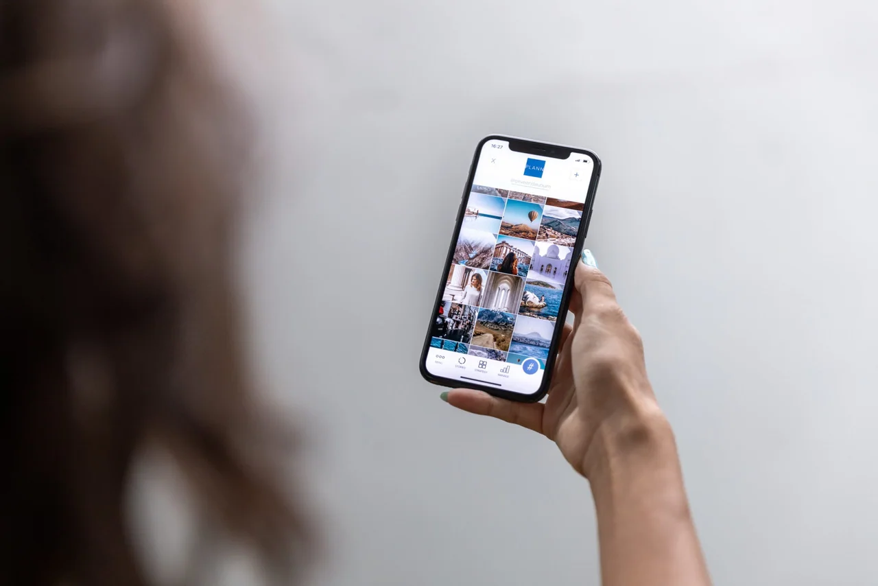
What makes mobile app UX good? It's an app that gets someone from open to done in as few steps as possible, on a screen they're holding in one hand, often while doing something else. At Code23 we've designed and built mobile experiences for over 20 years, from consumer apps to the field app operatives use on site every day, and the apps people actually keep share the same handful of habits: one job per screen, thumb-reachable buttons, and feedback the moment you tap something.
Get the basics wrong and people don't complain, they just stop opening the app. Get them right and it becomes part of someone's day rather than something they delete after one bad experience. Here's what that looks like in practice, from the fundamentals to the details most teams miss.
What is mobile UX?
Mobile UX is designing a user experience that is optimised for hand-held or wearable devices. You need to consider best practice for mobile usability including how to:
- make the best use of smaller screens
- cater to fingertip-friendly navigation
- deliver fast results with minimal effort
Good UX equals user satisfaction but it’s not as simple as creating a miniature version of your website. To borrow a phrase coined by Nokia, the key takeaway is ‘Don’t shrink, rethink’. When we’re re-thinking for mobile-first web design, we like to consider this quote from Apple co-founder, Steve Jobs:
“Design is not just what it looks like and feels like. Design is how it works.”
In other words, the look and feel of the mobile design is equally as important as the app’s functionality, which must be tailored towards the smaller screen. Which neatly brings us on to…

What are the essential features of mobile app design?
For us, the three pillars of successful mobile app design are:
- Simplicity
- Navigation
- Visual design
Simplicity
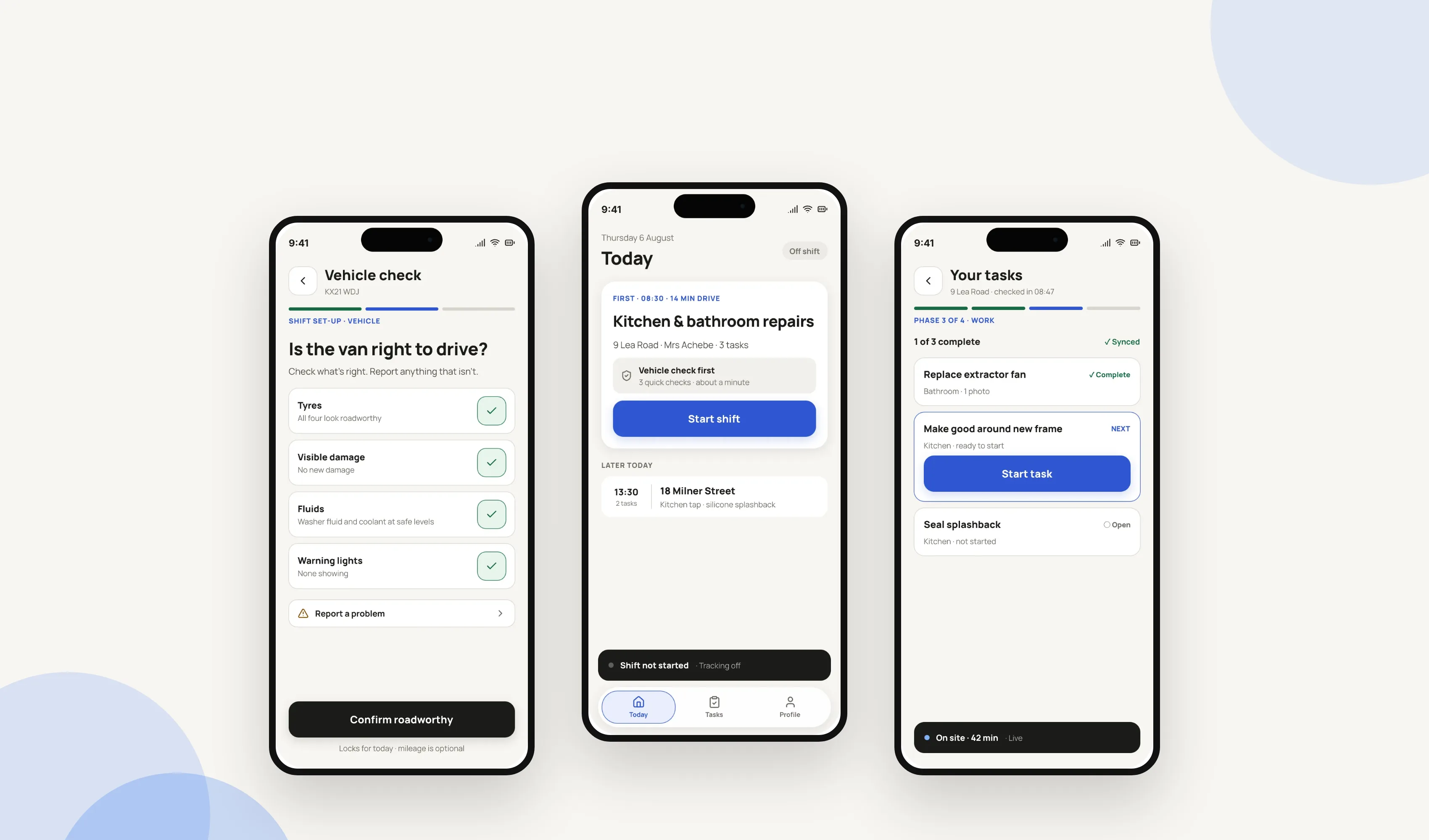
The mobile app design and interface should be easy-to-follow, clean, and intuitive. As 94% of mobile users use portrait mode, there’s limited width to play with so use your real estate wisely. To help people complete tasks with as few steps as possible, only include what’s needed for the user journey. This means they’re less likely to get bored or lost in your app. A good rule of thumb is to only include one call to action per screen.
Navigation
The user journey is all about the flow. To keep it moving forward everything should follow a logical structure that’s easy to navigate. If it’s not self-evident with minimal interaction, the risk is the user will spend time trying to work out how to navigate your app rather than concentrating on what you want them to concentrate on: your content. So consider quick and easy solutions to their needs and leave everything else out.
Visual design
The screen size is limited, there’s screen glare, plus people often use mobile devices whilst multi-tasking. But the good news is there are design tricks you can employ to create an eye-catching app. The first is colour which research has shown can affect behaviour and be attention-grabbing. In fact, that’s why The Simpsons are yellow. Matt Groening told the BBC,
“When you’re flicking through channels with your remote control, and a flash of yellow goes by, you’ll know you’re watching The Simpsons.”
The second visual trick is to ensure your typography and font size are legible. Apple recommends a minimum Body text size of 17pt and consistent use of font between platforms will also help reinforce your brand identity.
"We have been working with James and the team at Code 23 for about 18 months now on a lengthy and sometimes complicated app development. At all times we have found Code 23 to be calm, competent, and their advice has been invaluable. The app is now live and we are extremely pleased with the results and are happy to continue our relationship with Code 23 for enhancements and hosting. We would be pleased to recommend Code 23."
Our tips for better mobile app design
We’ve been building mobile apps since 2005, so we’ve watched mobile UX change constantly. These are the small design choices that make the biggest difference to the people using your app.
Consider user needs
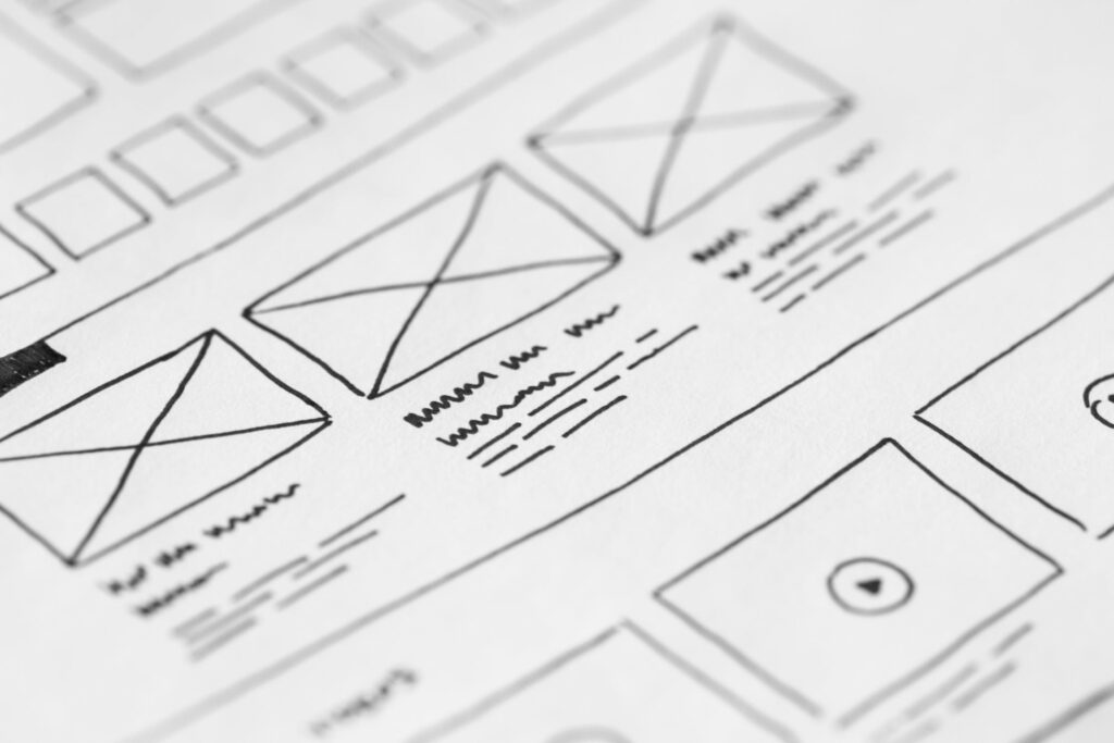
It can be tempting to overload your app with multiple features to try and grab the user’s attention, but this scattershot approach can often have the opposite effect. Instead, consider their needs and the purpose of the app. It’s fine to start planning the mobile UX development lifecycle with a broad brush as long as you trim back with each new pass. Simplify your app’s navigation as much as possible and eliminate nice-to-haves in favour of must-haves. Each tap (or swipe) should take your user one step closer to completing their goal.
Icons
When space is of a premium, icons are your best friend. Attention spans can be short in mobile UX and icons are a great shortcut to helping the user navigate through your app, explain a task, or simply make your app look less cluttered. Use familiar icons with visible labels or accessible names; don't replace explanatory copy unless users can reliably understand the icon on its own.
Easy searching
Designed for use anytime, anywhere, your mobile app should give the user a quick and easy route to discovering what they need with the minimum number of actions possible. This can include filtered searching, keyword searching, and barcode scanning.
All aboard
Onboarding is a vital component of attracting and retaining users. So adding features such as a ‘How the app works’ tutorial and multiple sign-up options will make a good first impression and help improve conversion rates.
Push notifications
There’s a fine line between annoying and enhancing, so use push notifications wisely. Try to ensure they’re timely, relevant, and add value to the UX. If they’re unnecessary or complicated, leave them out.
Finger-friendly
If you’ve ever tried to complete a lengthy form on a mobile, you know that the tiny keyboard isn’t conducive to essay writing. So, where possible, replace typing for tapping with fingertip-friendly call to action buttons and employ one-direction scrolling. You could also consider voice-activated commands for hands-free navigation. Voice input can reduce typing for appropriate tasks, but don't design interactions that encourage drivers to operate an app; cooking or other stationary tasks are a better fit for hands-free use.
The right form for forms
A fiddly form can be the perfect excuse for a user to end their experience with an app. If a data field is unnecessary, leave it out (do you really need a user’s email address, home phone number and mobile number?) Minimise user interaction with data inputting by including default values based on common results, saving user data to refill forms later in the journey, and including geolocation and autocomplete technology.
Feedback
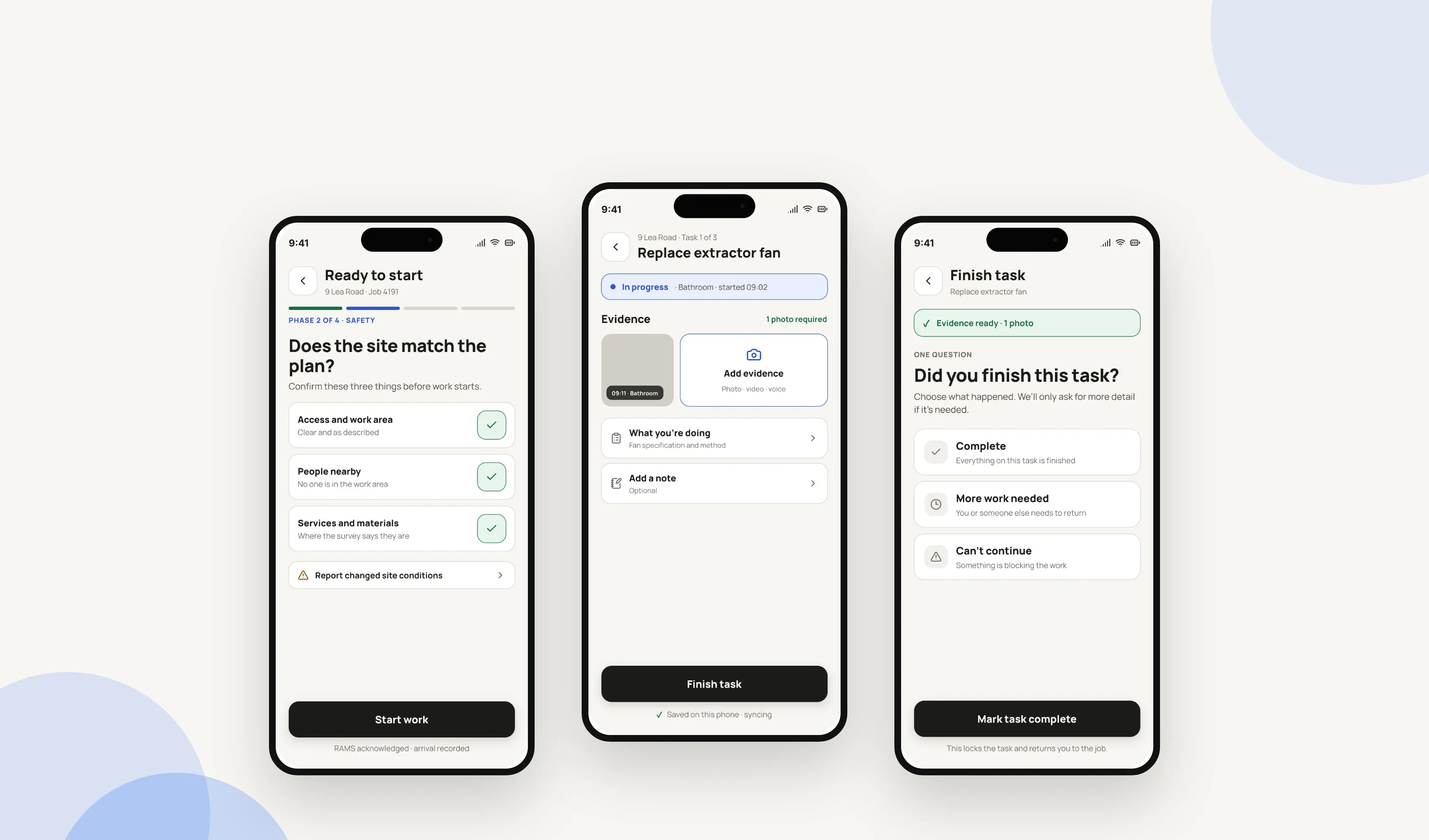
Have you ever completed an action on a website only to wonder if it’s registered your input? Annoying, isn’t it? That’s why responding to a user’s input is vital – even if it’s a simple tick icon that appears once the user’s completed an action, or a progress indicator to track their journey. In a similar fashion, a loading icon can eliminate a user’s fears that the app has crashed or is frozen by acknowledging that the app is processing their request.
Asking for consent
Permission requests can be a little off-putting – particularly if they’re the first thing a user experiences on an app. So unless the request is essential to allow the app to function properly, let the user experience the app for a while before seeking consent. That way they’re more likely to trust your app and see the value of connecting with it.
Syncing across devices
Synchronising across platforms not only ensures that there’s a consistent look, feel, and functionality, but it also allows the user to start their journey on desktop and continue it on a device. This can help boost conversion rates and turn a looker into a booker.
Pre-empt mistakes
Let’s face it, we all make mistakes. The secret to great mobile app design is to try and make those mistakes before your users do. By planning for the worst you can hopefully catch and rectify potential hiccups before your users even download the app.
Test, test and test again
A great-looking app means you’re halfway towards a great user experience. So don’t stop there. Testing the app’s ease-of-use and functionality is the only way to see if it works as well as it looks. If possible, let real users take the test drive for you as the fresh eyes can often spot things insiders miss.
Post-launch, continue to monitor the analytics so you can make tweaks as required to ensure your app stays relevant and useful to the user. After all, a UX-friendly app constantly evolves. A non-UX-friendly app risks extinction.
Frequently asked questions
What is user experience (UX) in a mobile app?
Mobile UX is how an app feels to actually use: how quickly someone gets from opening it to finishing what they came to do, on a small screen, often one-handed. Good UX means fewer taps, clear feedback and no guesswork. It’s judged by what people do in the app, not by how it looks in a design file.
How is mobile UX different from designing for the web?
A phone screen is smaller, held in one hand and used on the move, so mobile UX has to solve for thumb reach, patchy connections and short attention spans that a desktop site doesn’t. Navigation, forms and notifications all need rethinking rather than shrinking a website layout down to fit.
How do you improve the UX of an app that’s already live?
Start with the screens people abandon most, using real analytics rather than guesswork. Watch a handful of actual users try to complete a core task, fix whatever makes them hesitate first, then re-test. Small, evidenced changes, shipped and measured one at a time, beat a full redesign most apps don’t need.
How much does mobile app UX design cost?
It depends on the app’s complexity and how many screens and user types it covers. We agree a fixed price up front once we understand what you’re building, rather than charging by the hour. Get in touch and we’ll scope it properly before you commit to anything.
Next step
Good mobile app UX isn’t a polish pass at the end. It’s decided early: what the app is for, what to leave out, and where people will get stuck. That’s easier to see from outside your own product.
If you’re building a new app, or trying to work out why people aren’t sticking with the one you’ve got, tell us what it does and who it’s for. We’ll look at it properly and tell you where the friction is. We’ve designed and built apps and software since 2005, across 350+ projects, so we’ve seen most of the ways an app can lose someone.
Design the product
Make the product easier to use before you build it.
We’ll turn the key journeys into a testable prototype, remove friction and give the build team a clear product direction.